

 April 2023
Web design resembles fashion: new trends are mercilessly replacing the current ones every season. At the same time, some timeless styles never get old.
To keep the fashion metaphor going, your business’ website serves as its best outfit. 50% of surveyed consumers believe that website design affects the overall image of a brand.
50% of consumers believe that website design is crucial to the overall image of a brand.
[Source]
Unfortunately, even the best-designed website isn’t anywhere as enduring as a tailor-made suit. On average, a website remains fully functional and convenient to use for just 1.5-2.5 years. And this is bad news: 38.5% of web designers claim that outdated design is the main reason visitors leave a website.
That’s why we’ve decided to revisit our 2022 web design trends list. Some new trends are in, some are out, and others were updated to reflect better the direction of B2B web design in 2023. All of them come with examples to inspire the design of your website. Let’s dive in!
#1 Abstract shapes + bold colors = a website that stands out
Smooth, organic shapes and a vivid, contrasting color palette make an eye-catching combination. It’s a simple but effective way to make your website stand out and create a friendly, playful brand personality.
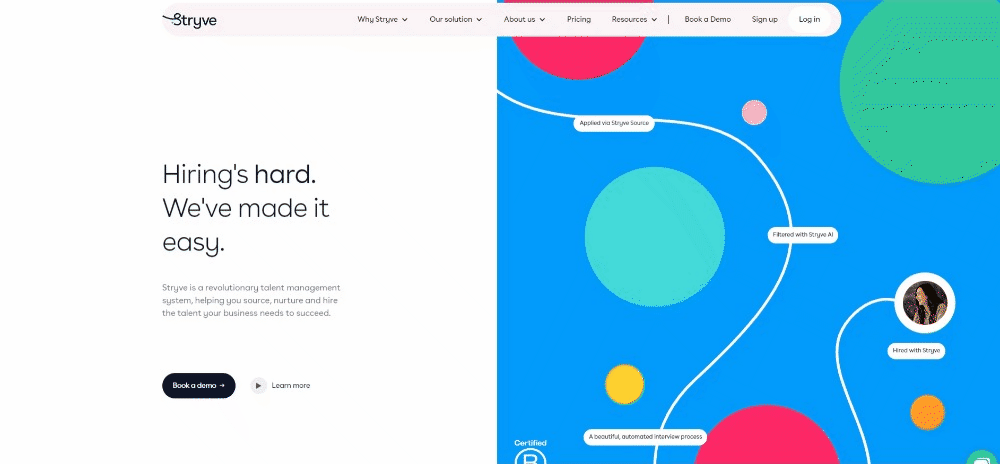
Abstract shapes work even better when you spice them up with flowing motion effects. Stryve, an HR solutions provider, used that mix to design a website that is a pure pleasure to scroll through. Each section feels special and instantly grabs your attention, inviting visitors to learn more about the product.
An even bolder example of bright-colored abstract web design comes from an unlikely industry: pest control. Pest Stop Boys’ (yes, they’re British, and yes, they get bonus points for the name 🎶) website is all about intense hues and floral figures. Even the cursor turns into a bubbling blob that changes color to contrast with the background—and lure out animated insect intruders.
.gif?width=689&height=320&name=chrome-capture-2023-2-29%20(1).gif)
#2 Minimalism — simplicity never gets old
If flashy splatters of colors don’t fit your brand's image, minimalism may be a better choice. It’s been around for a while, it isn’t going anywhere, and there are a couple of good reasons for that.
In minimalism, content comes first. Minimalist websites use a limited set of colors and design elements. This makes them clear and free from any distractions. Regarding the brand image, minimalism conveys elegance, reliability, and practicality.
That’s not to say that a minimalist website has to be boring. With its illustrations and subtle use of complementary colors, Notion’s website is a perfect example of a minimalist web design that’s functional and anything but dull.
.gif?width=691&height=319&name=chrome-capture-2023-2-29%20(2).gif)
You don’t have to go all monochrome to create a sense of minimalist clarity, either. Industrial solutions provider ACME achieves that through white space, a cohesive color palette, and delicate motion graphics.
.gif?width=689&height=318&name=chrome-capture-2023-2-29%20(3).gif)
#3 Brutalism — web design that goes against the grain
Not all trends constitute a coherent set of visual characteristics. Some of them are simply loose concepts. One such notion is brutalism. This seemingly self-contradictory style combines austerity and jarring aesthetics in defiance of the established principles of web design.
On the one hand, some businesses adopt brutalism to turn the uniqueness of their websites up to eleven, such as creative agencies, architectural practices, and fashion brands. Here, you can expect anything: wild geometry, wacky typography, surprising motion effects, and website architecture that verges on unusable. All that is to express creativity and originality.
.gif?width=693&height=319&name=chrome-capture-2023-2-29%20(4).gif)
[Source: GEO]
.gif?width=691&height=322&name=chrome-capture-2023-2-29%20(5).gif)
[Source: PART Architects]
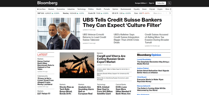
Then there‘s the second face of brutalism: purely utilitarian designs that put minimalist websites to shame. Take a look at Bloomberg’s website. Its barebone structure seems retro and modern at the same time. The color is used sparingly to turn visitors’ attention to important sections. The primary purpose: present news in a clear, no-frills manner.
#4 Dark mode — elegant and light on eyes
Looking for an easy way to stay chic? Wear black. Similarly, if you want to keep your website sleek, black is your color of choice. Other benefits of dark mode website design are reduced eye strain and better battery efficiency. Additionally, some users may find light text against a dark background easier to read.
In the business context, black expresses elegance and trust. These associations work well for fintech companies such as Revolut Business or Uplinq. Plus, black goes great with all colors, making incorporating the current brand style easier.
.png?width=758&height=323&name=chrome-capture-2023-2-29%20(1).png)
.gif?width=760&height=349&name=chrome-capture-2023-2-29%20(6).gif)
#5 Video, animations, interactions — putting websites in motion
From YouTube to TikTok, video has become the dominant format across the web. In website design, videos help increase engagement and present the product or service more entertainingly. Animations, interactive elements, and other motion effects serve a similar purpose and add visual interest to the design. That’s why no matter what style you’ll go with, including some form of motion will make your website more appealing.
Take Mailchimp’s website. Its deceptively simple design hides a gamut of satisfying motion effects: bouncy buttons, zoom-in photos, animations, highlights… Hovering over every single element of the website is fun and encourages exploration.
.gif?width=693&height=318&name=chrome-capture-2023-2-29%20(7).gif)
In addition to videos, Zendesk goes the extra mile and showcases its product through an interactive demo. Visitors can submit a customer service ticket and solve it from the perspective of a CX agent in an 11-step tour. Talk about great customer care!
.gif?width=688&height=332&name=chrome-capture-2023-2-29%20(8).gif)
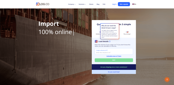
Forms are an even simpler way to effectively engage your customers-to-be. The website we designed for a logistics software company KLog features a form allowing visitors to get a quote for their shipment on the fly. Combine it with the explainer video, illustrations, and motion graphics, and you have a clean B2B website that tells everything one needs to get started with a product.
#6 Scrolling effects — less clicking, more fun
If your website consists only of static images and blocks of text, you can’t really blame visitors for giving up halfway. Instead, you can turn scrolling into an engaging journey that keeps them invested all the way to the bottom of a page. That’s scrollytelling: a web design trend where every scroll reveals a new image, causes text to pop up, or triggers an animation, leaving visitors curious for more.
The homepage of Reputation Squad, a communication monitoring company, presents its services, team, and case studies all in one scroll. To keep visitors engaged, the website combines sliding text with shifting backgrounds and abstract, cursor-following shapes.
.gif?width=692&height=320&name=chrome-capture-2023-2-29%20(9).gif)
Superlist’s scrollytelling website is centered around the product—a to-do-list software. By moving the cursor horizontally at the top of the page, visitors can see how to use Superlist with friends and colleagues. Scrolling down reveals more use cases through animated screenshots, horizontal slides, and moving text, all on a single page.
.gif?width=691&height=319&name=chrome-capture-2023-2-29%20(10).gif)
#7 Accessible web design — making everyone feel welcome
Fashion may not always be about convenience, but for business websites, it's a must. The number of internet users has been growing steadily for years, so removing accessibility barriers is an important and necessary trend.
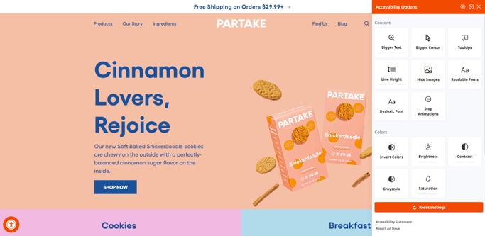
There are many ways to ensure that all visitors can use your website. One of them is an accessibility widget such as the one used by the online bakery Partake. The pop-up allows visitors to adjust how the website looks and behaves, e.g., by changing font type and size, switching contrast, turning off animations, or even showing header hierarchy.
Website structure and content are just as important for accessibility as customization. A good example is Patagonia, whose website has clear categories, non-intrusive motion effects, alt image descriptions, and high-contrast text. The company also explains its efforts to make the website easily navigable in its accessibility statement.
-1.gif?width=1000&height=464&name=chrome-capture-2023-2-29%20(11)-1.gif)
#8 Mobile-friendly web design — small screens, big opportunities
Globally, the percentage of mobile internet traffic is at an all-time high of over 60%. That’s why, despite being nothing new, mobile-friendly web design remains relevant in 2023.
To ensure a consistent browsing experience on mobile, all elements of your website—text, media, layout—should adapt to screen size and orientation. Walls of text are even more unreadable on smaller screens, so you should consider the volume of your content, too.
It’s also important to account for touchscreens. Keep navigation features at the bottom and enlarge buttons so that they are at your mobile visitors' fingertips. Remember that some gestures, like horizontal swiping, feel more natural on smartphones. This gives you additional options when designing a mobile-friendly website, e.g., swipeable product cards or images.
Wise’s website offers a similar experience regardless of the device. The features and content available in the desktop version are present in the mobile view. This includes a currency conversion calculator and motion effects, all without an impact on performance.
.gif?width=542&height=252&name=chrome-capture-2023-2-29%20(12).gif)
.gif?width=164&height=345&name=chrome-capture-2023-2-29%20(13).gif)
Wise website in desktop and mobile view.
Choose web design trends that work
Any true fashionista will tell you that you shouldn’t blindly follow trends. Instead, they should serve as inspiration to help you find a style that fits you best. The same goes for B2B web design: knowledge of web design trends surely helps, but creating a stunning and effective business website requires time and skill.
Not sure where to start? Our web designers and developers are here to help—get in touch and share your ideas!


 September 2023

