Imagine spending six months designing, developing, and fine-tuning a perfect website to promote your business. You team up with graphic designers, copywriters, and developers, plan the layout, dwell on the ideal font type and size, and choose just the right shade of pink and yellow to make your design truly stand out.
Once you’re done, everything seems perfect, like a dream come true. Until you hit that ‘Publish’ button and go live.
Because then… nothing happens for days, weeks, and months.
All this time and effort for nothing! How frustrating is that? If only you could turn back time and avoid making these critical mistakes when launching your website…
There might still be hope for you—that is, if you are yet to do the launch. So if you don’t want the worst case scenario to materialize, read on.
Common mistakes when launching a website
Do you think you’re ready to go live with your website? Think again. And again! Based on the experiences of dozens of international customers we’ve worked with throughout the years, we’ve learned that the same website launch mistakes are made repeatedly:
- Building websites for yourself (or your CEO). Many internal teams in charge of website design and development rely on their subjective taste rather than what their audience wants. As a result, when the website goes live, they give themselves a pat on the back while their website visitors remain unimpressed (and wave goodbye). The same happens when web design and development teams try to make the CEO or CMO happy instead of focusing on making the site appealing to the users.
- Keeping the website design busy to extremes. A token of bad website design? Clutter. The poor, unintuitive layout leads to hard-to-navigate pages overstuffed with text, graphics, banners, buttons, and other UI elements. When web design is concerned, less is usually better and, most of the time—more user-friendly.
- Waving bye to the good stuff too soon. When our clients ask us to migrate their website to HubSpot, it’s often impossible to do that with zero changes. However, we always try to recycle the existing content as much as possible when we see it still has the potential to drive traffic to the new site. Don’t underestimate what you already have; consider what works, keep it, and see what doesn’t—then upgrade it.
This is just the tip of the iceberg, and we have plenty more examples of our clients' mistakes when planning a new website. Want to know what else to watch out for? Reach out to us. We’ll help you figure it out! And in the meantime, see what items to check if you do want to launch the website quickly.
How to launch a website? [CHECKLIST]
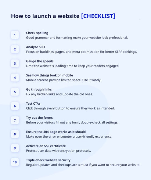
Now that you know what not to do, let’s get down to business and cover ten frequently overlooked steps for launching a website. Note that this is not a complete pre-launch checklist, but it can still prove website-saving. Also, applying these steps shouldn’t take much time, and we guarantee you won’t regret it. Let’s get down to it!

Check spelling
Starting with the basics, you must remember to proofread your content. Correct spelling will go unnoticed by your visitors, but once they catch typos, misplaced punctuation, or extra space between words, many might leave without reaching the end of the page.
Getting things spelt out right boosts your brand image and shows respect for website visitors. And you don’t want to appear careless and sloppy, right? Fortunately, you don’t have to go through each sentence manually to ensure everything is in order. Plenty of lifesaving tools exist to automate and speed up spellchecking. The most popular, like Grammarly, Hemingway Editor, Language Tool, Writer, or QuilBot, provide paid and free subscription plans if you want to test them out.
Grammarly provides spelling, grammar, and punctuation suggestions to make your writing sound better.
Run an SEO analysis
Good SEO and technical SEO are critical for launching a successful website. To get optimization right from start to finish, you need more than an hour and (ideally) a team of SEO experts, as this task involves more than just finding well-performing keywords. For this checklist, let’s just stick to optimizing all pages, backlinks, meta titles, and descriptions to level up your SERP (Search Engine Results Pages) rankings.
You can use simple tools such as Seobility SEO Checker or SEOptimer SEO Audit & Reporting Tool. They analyze your website to highlight linking errors, structure and headings issues, and potential optimization improvements for better performance. If you operate on HubSpot, your CMS will work for you, as it provides SEO recommendations for specific pages and blog posts to help you launch a new website successfully.
In HubSpot, you can view SEO improvement suggestions for every page on your website.
Gauge the speeds
How to launch a website that takes minutes to load and call it a win?🚨SPOILER ALERT, it’s impossible. Fluffing up your website with vivid, high-res images, videos, and animations can affect the speed. And according to Google, loading time longer than three seconds increases the bounce rates by 32%. You might want to keep bells and whistles to a minimum! Or… leave the website design to professionals who will ensure the right balance of sleek and quick.
But if you choose to go on your own, make sure to use tools like PageSpeed, Pingdom, or GTmetrix to perform a speed test, determine your results, and discover which elements you can upgrade.
Google research shows how increasing page loading time affects the bounce rate.
See how things look on mobile
Almost 60% of online traffic comes from mobile devices. That’s why ensuring the mobile responsiveness of your website is the key to its success. HubSpot allows achieving that with minimum effort and development, but you must double-check the results before going live.
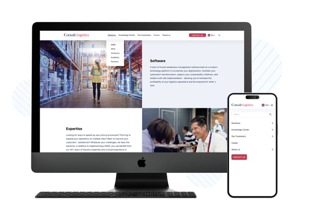
Here’s an example. When building a website for our client Consafe Logistics, we focused on mobile design first and adjusted it to desktop standards later. All interactive elements are visible, large enough, and easy to click to avoid the ‘fat finger’ problem and users’ frustration. We adjusted the navigation and menus to the mobile, intuitive vertical orientation. As mobile screens provide less space to work with, we also reduced all content to a single column, with texts under images rather than next to them.

To improve user experience for our client visitors, we designed different navigation menus for mobile and desktop versions.
Go through links
You want to delight your visitors, not infuriate them. And only a few things make them more livid than broken links. Therefore, before you launch a new website, check all your links to ensure they point your visitors exactly where you want them to go. Verify all menu and footer items, link your logo to the homepage on every page, update old links, and double-check if your social media icons are clickable.
Tools like Dr. Link Check and Ahrefs Backlink Checker will help you identify your broken links and discover links’ overall performance.
Dr. Link Check performs a quick scan to find broken and harmful links on your website.
Test CTAs
Even experienced copywriters and content writers may struggle to find the best CTA. And getting it right is vital to encourage your readers’ actions. However, even the most compelling copy won’t help if the button doesn’t work.
✅ Good CTA: Clean, visible, straight to the point.
[Source: KlientBoost]
❌Poor CTA: Lack of visible CTA under the page title.
[Source: Kayako]
To get your CTAs right, click and test every button before you launch a new website. In HubSpot, you can create and view all your buttons to automate the process.
In HubSpot, you’ll find all CTA settings by navigating to Marketing > Lead Capture > Button CTAs.
Try out the forms
Forms are a great tool to gain new leads, collect payments, or allow potential customers to contact you via email. So before you launch a new website, check if your forms are correctly placed, easy to read, and direct users to a ’Thank you’ page or downloadable asset. See also if all validation error messages work as intended.
If enabled, email notifications should be sent automatically. Still, don’t trust this blindly; it’s best to test out email delivery yourself.
HubSpot lets you adjust all necessary form settings. To create and edit forms, go to Marketing > Lead Capture > Forms.
Ensure the 404-page works
When users go to a page that doesn’t exist, they will be redirected to a 404 error page. But you don’t need to welcome them with a dull “Sorry, this page doesn’t exist” message. Instead, try creating a custom error page to explain what happened and take your users to a page that works with a functional CTA.
[Source: HubSpot]
Activate an SSL certificate
SSL (Secure Sockets Layer) certificate is a protocol securing a connection between a web server and a web browser. It ensures user data encryption and boosts your website’s search engine results. You can tell a website is protected when the URL begins with HTTPS instead of HTTP.
Websites built with HubSpot come with an already activated standard SSL certificate. For manual setup, you’ll have to request a CSR (Certificate Signing Request) from your hosting provider or let professional security services handle that for you. Platforms like GlobalSign provide SSL/TLS management solutions.
Triple-check website security
SSL certificate is a must, but much more is required to make your website safe for visitors. Once the website goes live, update it regularly, back up your content in case of malicious attacks, and perform routine scans using security monitoring tools like Detectify, Sucuri, or UpGuard.
[Source: UpGuard]
Summary
If you’ve made it so far, you’re ten steps closer to launching your website Hopefully, these tips will suffice before a complete website launch audit comes. HubSpot lists 80—yes, e-i-g-h-t-y—things to check before D-Day! It sounds like a lot, but don’t worry about that. We can take care of it for you. Just leave us a message!


 September 2023
