Remember the websites of the late ’90s? Cluttered layouts, garish colors, and the pervasive Times New Roman — in the infancy days of the internet, the web would put up with anything. Back then, just having a website for your business meant living in the future.
Today, that’s not enough anymore. We visit dozens of websites daily and grabbing users’ attention for longer than a few seconds requires something extra. Namely, outstanding web design. With 94% of users declaring that their first impressions upon entering a website are related to its design, a site that’s both functional and visually pleasing is a must.
But in design, nothing is set in stone. Many creators agree that today, trends are changing faster than ever before. That’s why sheepishly following them might not be a good idea. However, it’s always important to keep up with the latest things and take inspiration when necessary.
Luckily, we’ve done the research part for you. So join us as we dig into nine website design trends that will dominate 2022.
Trends in website design that kill it in 2022 [With examples]
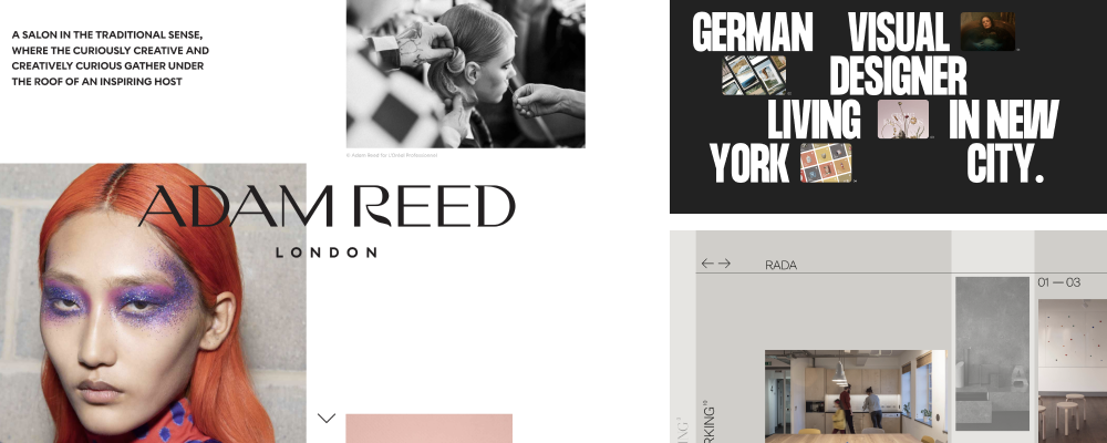
#1 Asymmetrical layouts
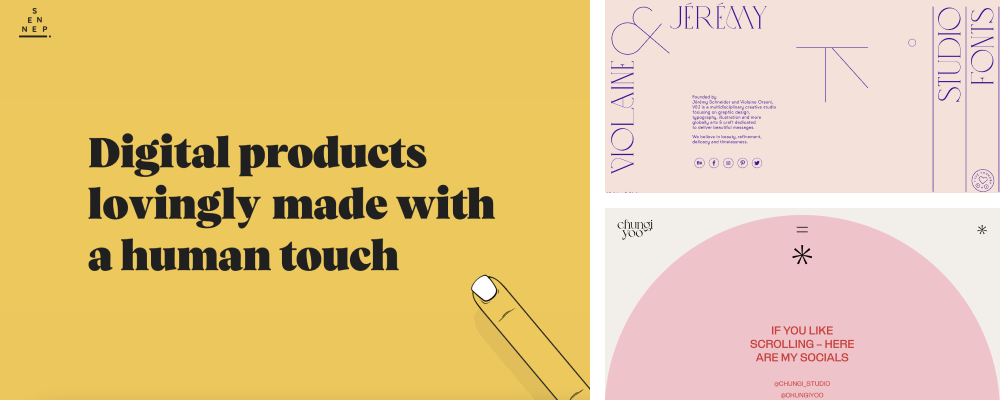
In web design, asymmetry communicates creative freedom, dynamics, bold decisions, and experimentation. With an off-kilter grid, the site becomes more memorable and interesting, the content presentation is more expressive and emotional, and page space can be used freely.
That being said, conventional layouts aren’t going anywhere. But, in 2022, we expect to see more web designers play with non-uniform grids and positioning.
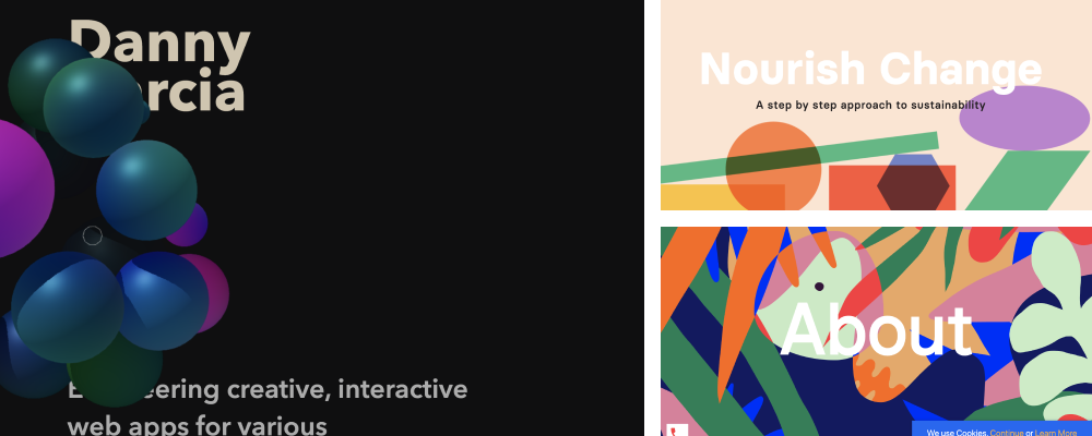
#2 Geometric shapes and abstracts
Straight lines, circles, triangles, trapezoids, and all kinds of abstract shapes will be on the rise in 2022. It’s easy to see why designers are so fond of geometric figures: they’re simple and minimalistic but at the same time stylish and eye-catching.
Perfect stock photos have also been losing their appeal. Instead, they are replaced by abstract illustrations—futuristic, bright, or hand-drawn. Mind you, though, that the choice of style depends only on the philosophy of the company and the message it wants to convey.
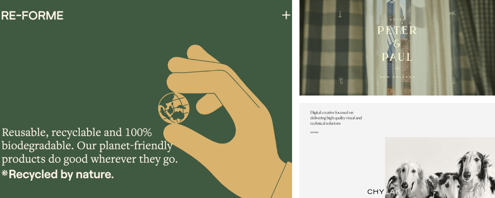
#3 Minimalism
This design trend has existed for a while and is here to stay. Minimalism will continue to help designers create websites that are simple, functional, and memorable.
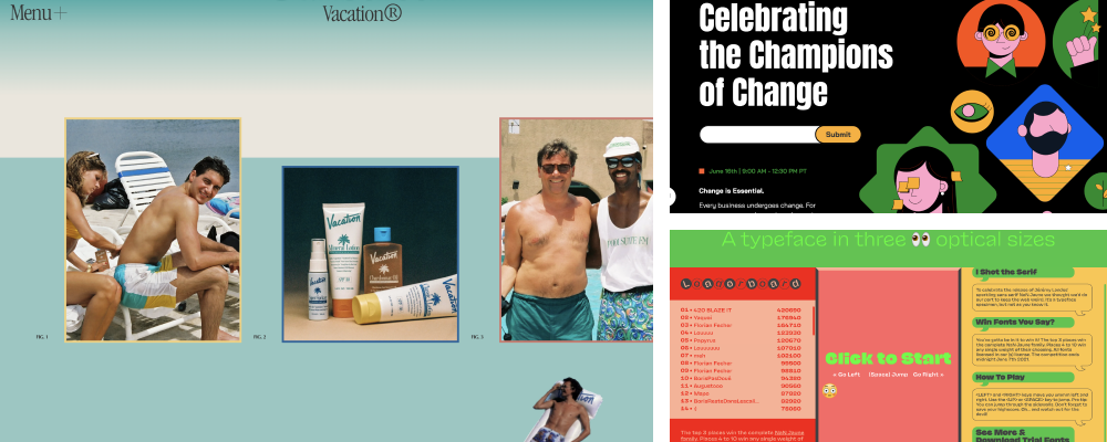
One thing that will change, though, is the color palette. We often associate minimalistic designs with monochrome backgrounds, but it’s not all just black or white. Right now, colorful, dynamic minimalism is gaining traction, with vibrant backdrops, a thoughtful mix of simple serif and sans-serif fonts, and carefully selected sets of elements—all used together to create clean yet stunning sites.
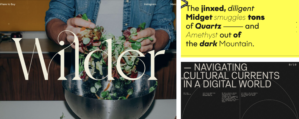
#4 Typography gigantism
Typography is one of the main tools for expressive design and has a tremendous impact on visual perception. It turns headlines and textual content into bold messages that intrigue users and demonstrate the key benefits of a product or service.
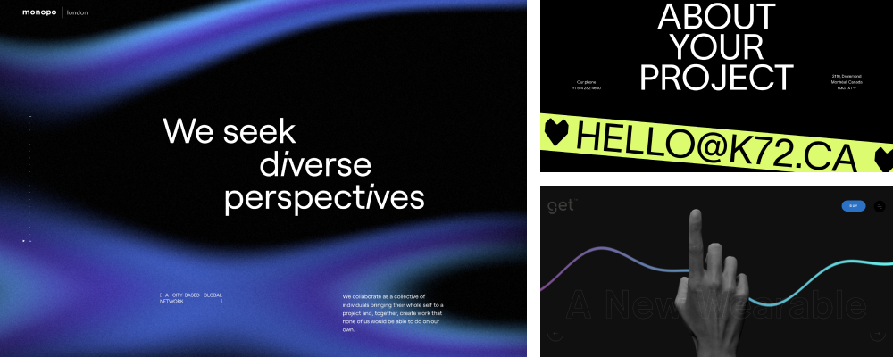
You can emphasize these elements by playing with text size, turned up to the point when they may take up a better part of the home page. Such typography works well with minimalistic layouts against a brightly-colored background. It will also look good with maximalist ones, where large text in a stylized font is displayed over large photos.
#5 Dark mode
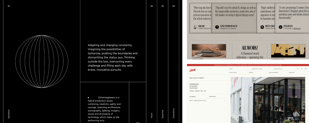
Going dark is a great way to make your website look modern and elegant—plus easier on the eyes. A dark theme improves readability and gives the website that “premium” feel if done right. The key lies in contrast—dark backdrops allow designers to put specific website elements in the limelight by cleverly using more lively colors.
At the same time, remember that dark themes are not for everyone. Consequently, before you use them, ensure the design remains consistent with your brand’s visual language.
 September 2023
