


 April 2022
Imagine you’re looking for new headphones. Not just any headphones, but a pair that will serve you for years on Zoom calls and when you catch up on your favorite audiobook. You want to ensure that the sound quality is top and that the set sits comfortably on your head. So rather than going through the hit-and-miss of online orders and returns, you decide to head down to a brick-and-mortar store.
Building intuitive websites: What can e-tail learn from retail?
There are two stores in your area. They offer low prices, have a wide range of audio equipment, and are close to your home.
However, store A is super easy to move around, you can always find what you need there, and the staff is helpful and knowledgeable. Plus, the store offers a flexible installment plan. On the other hand, Store B is small, crowded, and hard to navigate. The few clerks are never there when you need them, and finding a place to park your car is a nightmare. So how do you think which store you’re more likely to buy from?
It may surprise you that we talk about physical stores. Still, online shopping sites closely resemble brick-and-mortar regarding the visitors’ experiences and how they affect purchasing decisions. And not only shopping sites. When you run any website, its usability can make or break your business. You know, it’s the first impression that counts, and in the digital world, you only have a few seconds to convince visitors to stay. This article explores how to do it by building an intuitive website.
What is website usability?
When we look at Wikipedia, web or website usability is defined as “the ability of Web applications to support web-related tasks with effectiveness, efficiency, and satisfaction.”
Trying to make this definition more user-friendly, we could say that web usability is the ease of using a website or an application. It is a set of principles applied to make it simple, fast, and pleasant for visitors to navigate, read, find the information they need, and achieve their intended goal.
Again, when we compare a website to a physical store, you want to ensure every potential client (website visitor) can easily find your page, go through it, head to the section they want, and leave satisfied, having achieved what they came for in the first place.
So if we were to come up with our definition, it would read: “The usability of a website describes how easy and satisfying it is to read, understand, navigate, and use.”
Why does website usability matter?
Since most web pages aim to generate a profit as the end goal, they must follow the principles of website usability, which affect the visitor’s mood and behavior.
Usability impacts, for example, how long users stay on your web page, whether they can find the answers to their questions, or if they will move to a competitor’s website searching for the information they couldn’t find on yours.
One of your main goals when designing or optimizing any website should be to attract and engage potential clients and make your website useful for them. The key to success is putting your visitors’ needs first.
A properly configured, user-oriented and intuitive website can boost conversion rate, increase average cart size, and improve order frequency. And there is research to back up this claim. Highly usable web pages positively affect the user experience (UX), which directly correlates to your getting sales or collecting subscriptions:
- When a website takes more than one second to load, the bounce rate increases by 123%.
- 79% of users who can’t find what they’re looking for on a website will abandon it.
- 88% of online shoppers said they wouldn’t return to a website after a bad experience.
How to make a user-friendly website?
As you can see, ensuring website usability is essential for your digital success. But what is ‘optimal usability’? When do you know your website is usable enough?
Website usability is a sum of many factors. But some web design issues are more prevalent than others, making many pages lose their appeal—and visitors. So, a good place to start optimizing visitors’ experience with your website is by applying these essential tips that will help you deal with some of the most notorious usability pains.
1. Remove needless information
According to statistics, 62% of users leave the website because it contains too much text. Conversely, decreasing the copy volume can lead to a 58% increase in usability. What’s more, an average web visitor only reads 28% of the information on your website. The conclusion is simple: cut down on irrelevant words and focus on the essentials.
2. Align with visitors’ reading patterns
Sight is the primary sense humans use when browsing the web. Visitors spend 80% of the time looking at information above the fold line, while 69% focus on the left side of the page. That makes the upper left part of your website a perfect spot to highlight key information.
3. Make your content scannable
To make a website useful for visitors, you need to learn their habits. Most people will look at the first two lines of text on the first screen and then scan the rest of your content vertically until the bottom. That is a so-called “F-shaped reading pattern.” Knowing this, you should consider:
- discernible, horizontal titles,
- vertical fill-in forms,
- a vertically-oriented navigation bar.
4. Ensure fast page loading
Nobody likes to wait. Statistically, 4 out of 5 users will leave a website that takes more than 0.25 seconds to load. So whether yours is a news platform or an online shop, you should always aim to provide a smooth and fast user experience. Scaling down the copy volume, optimizing image sizes, and testing are all good first steps to delivering it.
5. Adjust the search bar size
The search bar is a fundamental feature of any website. Unfortunately, the average search box is 18 characters wide, accommodating only 27% of all requests. To ensure that your clients can type in most queries, increase the size of the search box to 27 characters — this will meet 90% of requests.
6. Standardize page layout
Consistency is key in high-usability web design. This rule also applies to the size of your layout, which should remain the same throughout your website. The golden dimensions are the 1000-1600px length and 770px width.
7. Make your design stand out
Let flashy websites stay in the 2000s. Today, minimalism rules supreme. That’s not to say that multiple colors are a no-go. On the contrary, a distinct and tasteful color scheme can make your website more attractive and easier to navigate. Just don’t overdo it — two primary colors and two secondary colors are all you need.
8. Nudge users to click
Back to consistency, your website should use commonly recognizable patterns, such as distinguishing hyperlinks. A highlight or contrasting font color will help users immediately understand that a particular phrase or word is a clickable link and follow through.
Optimizing your website’s key elements
In addition to these general tips, we’ve also identified five fundamental areas that have the largest impact on user experience. Learn how to improve them for the best effect.
Website header
The website header is placed at the top and often remains visible when users scroll the page (the so-called ‘sticky header’). Due to its position, it’s crucial for navigation and should include:
- The company logo or a website/blog name, and a descriptor, for example, “Vegan Sweets” or “Affordable Sunglasses.” This important element immediately explains what the visitors will find here.
- Conversion elements, such as “Leave a Request” or “Get Started” CTAs, “About” section, or cart, are usually placed in the right upper corner. It’s a good idea to adhere to this pattern as it increases the chances of conversion.
- Contact details. Always place contact information where visitors can see it easily. Offer different contact options—phone, email, chatbot, etc., to allow visitors to choose the one they feel more comfortable with.
- If your website includes a login into a personal account, place the “Registration/Login” button at the top right of the page. Don’t make the header too big, but pin the login to the page.
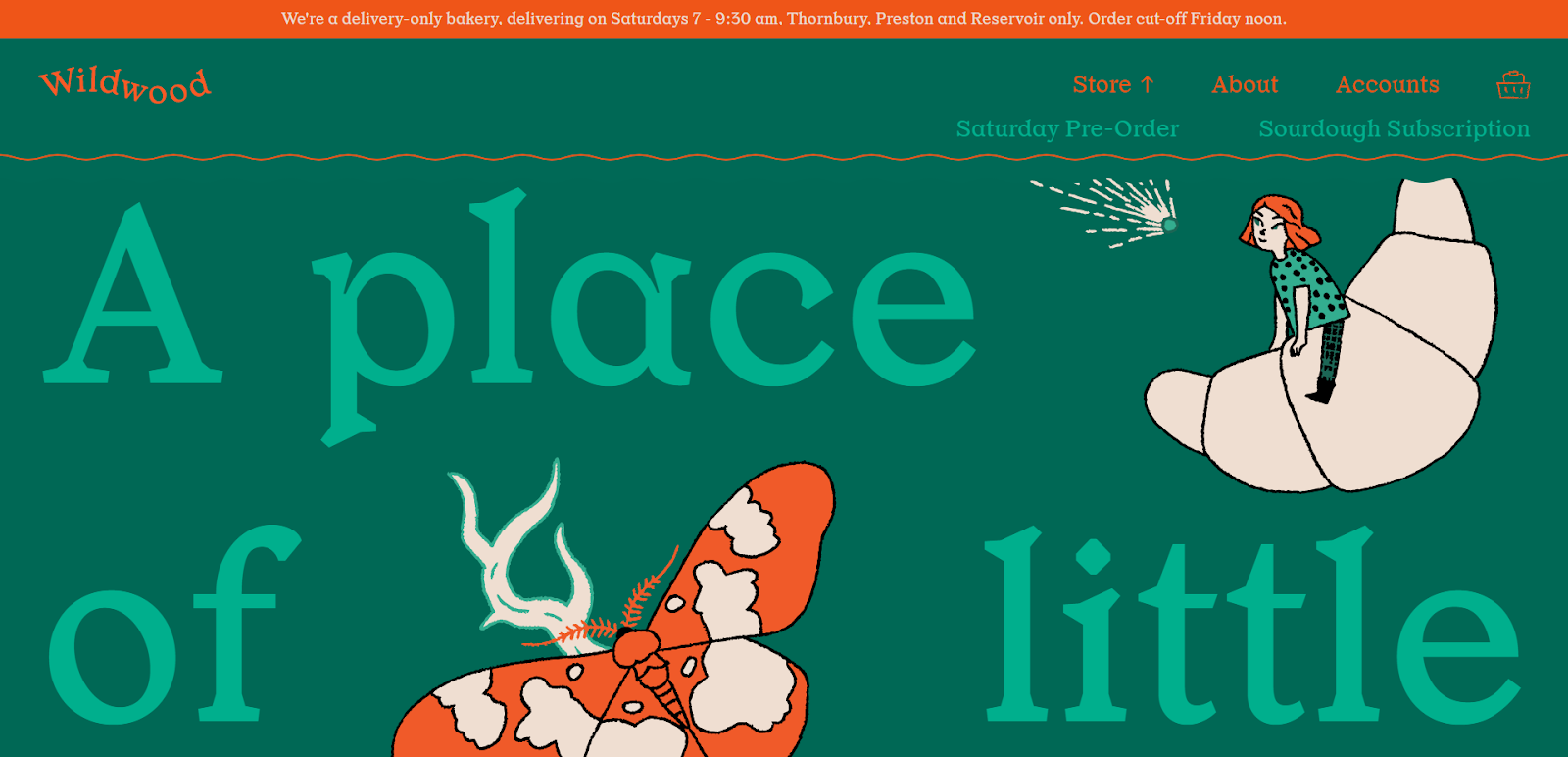
Wildwood Bakery from Australia boasts a neat, pretty website that keeps the header simple and effective. It’s cut down to the minimum, but it contains everything the users need.
Homepage
Think of the homepage as a virtual storefront. It briefly presents your offer and encourages visitors to take action, e.g., to buy or order a product or service. Don’t overload the homepage with content, but avoid making it seem empty or incomplete. To improve its usability, consider the following:
- A prominent banner. It should be visible and discernable. The main thing is not to overdo it.
- Benefits. Showing the advantages of your products or services helps visitors better understand them and compels them to seek further info. For example, lists, icons, and numbers improve readability and look better than plain text.
- Links. Use links that redirect visitors to important sections of your website for smoother navigation and a longer time on the site.
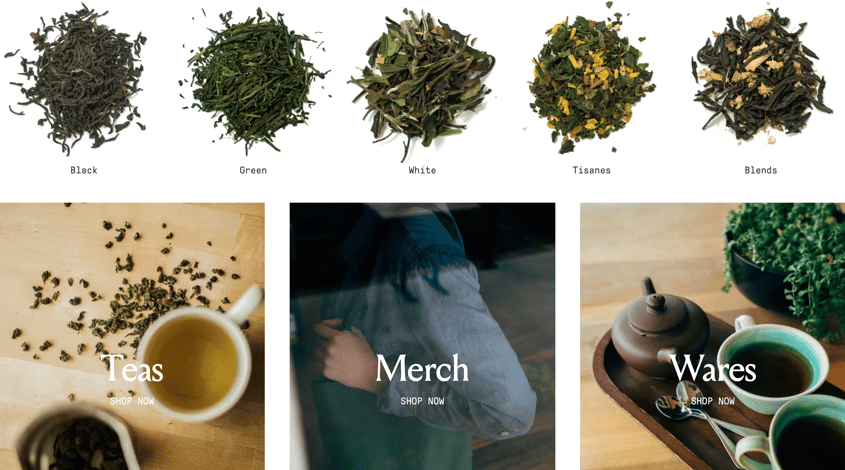
Swallowtail Tea hits the spot with a homepage that readily presents all product categories and highlights the variety of available tea types.
Navigation
Keeping visitors on your website is often a matter of whether they can easily move around it. Try the suggestions below to improve your navigation:
- Menu. The menu should display service and product categories. Preferably, a vertical menu should reflect the structure of the website. You can create multi-level lists and highlight them with color. However, avoid going over three category levels — huge and overly complex menus will scare off visitors and harm your SEO.
- Site footer. Customarily, there are some sections that most visitors will expect to find here. These include newsletter registration, links to social media, and legal notice.
- The up button. Scrolling back to the top can be a pain when your visitors reach the site footer. Make their lives easier by adding a “back to top” button.
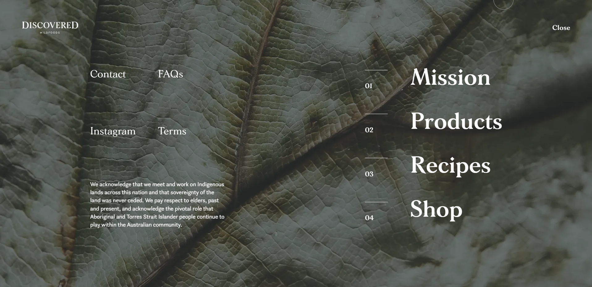
Discovered Wildfoods’ website has a drop-down menu screen that allows users to reach crucial sections anywhere.
Product page
If you have an online store, your primary concern is to facilitate placing orders. To that aim, pay close attention to:
- Product directory. It should contain images of the same size, quality, and format for a consistent, pleasant look. What’s essential, visitors should be able to buy any product with a single click.
- Product card. Place the product image on the left to instantly draw the visitors’ attention. Then, add a zoom feature, photos from different angles, or even a 360-degree tool for a near-real-life product look and feel. Then, present all the necessary info on the right.
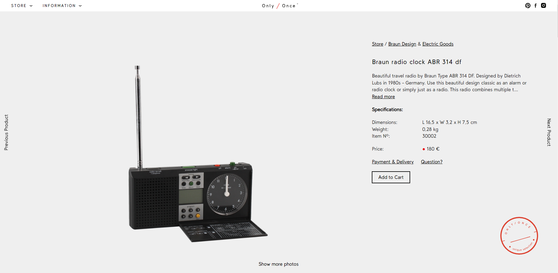
Only/Once uses product pages to lay out all the info about its vintage electronics. Each page comes with many product photos, descriptions, and technical details.
Order form
A lengthy order placement form can discourage visitors from buying, and this is the last thing you want! How to avoid that? Try some of our tips:
- Reduce the required fields to the minimum. A visitor must often only provide a phone number or email and delivery details to place an order. So make it easy for them by clearly indicating mandatory and optional fields.
- Ideally, remove the captcha. If it is necessary, install the simplest one. Users are annoyed by solving the traffic lights puzzles to prove they are humans.
- Make the call-to-action (CTA) buttons distinguishable.
- Send an email or display a confirmation window after the user submits a form.
- Don’t neglect the cart section. Include visualizations of added products. Be sure to include the total cost of the purchase. Also, indicate the cost of each delivery option upfront.
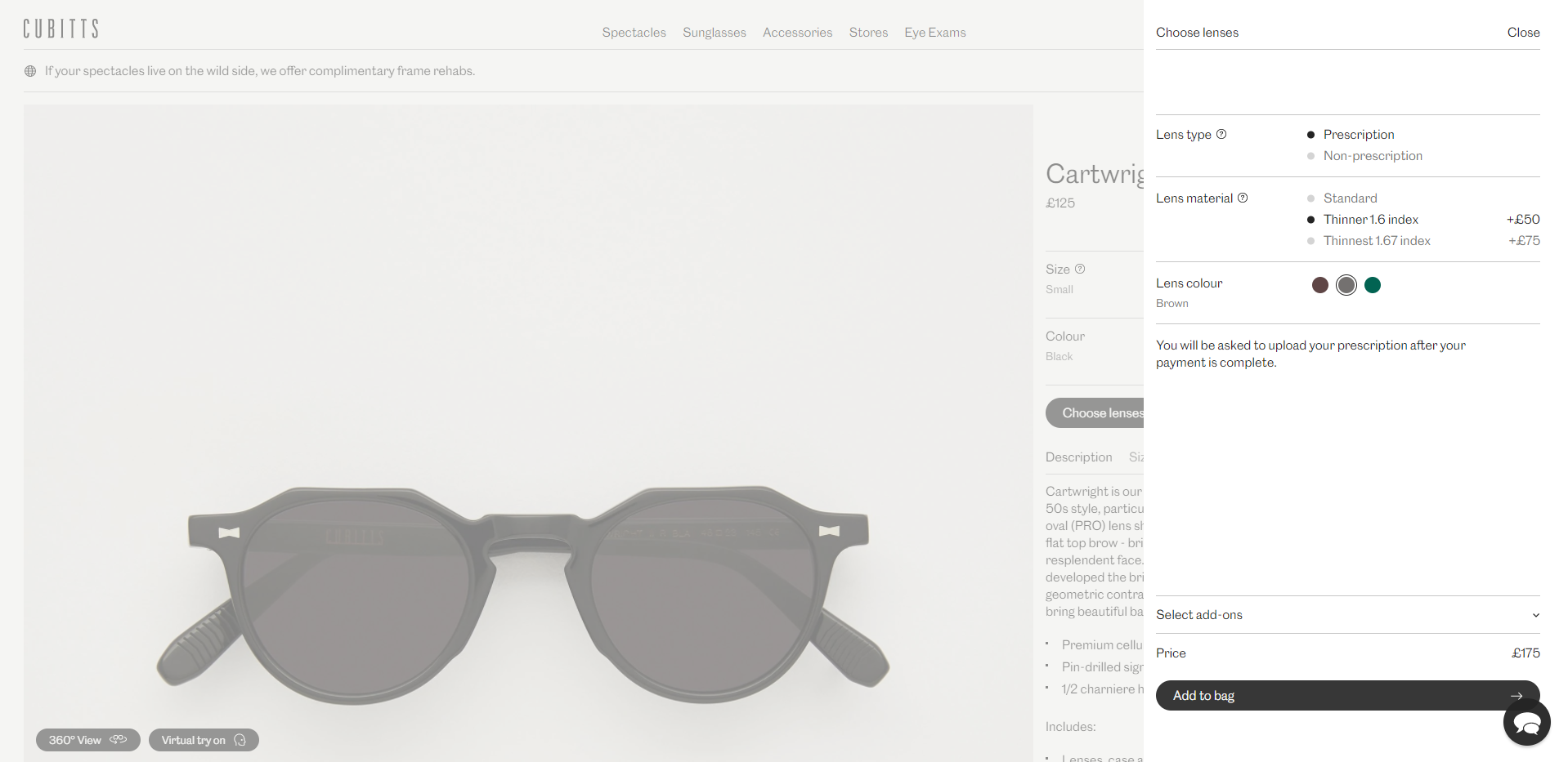
Sunglasses usually require a longer user flow to complete an order. Cubitts managed to fit the lens adjustment process into a single screen without omitting the important details.
Website usability is worth the effort
This article merely scratches the surface of the website usability topic. But, by now, you should be well aware of the importance of a good, well-thought website user experience.
Treat these tips as a stepping stone to building a website that delights, attracts, retains visitors, and turns them into buying users. And remember, making your website intuitive and usable is a never-ending process, but the more you optimize, the more sales follow.


 September 2023

